Absa Bank.
Redesigning a corporate web presence for one of Africa's largest banks.
The problem
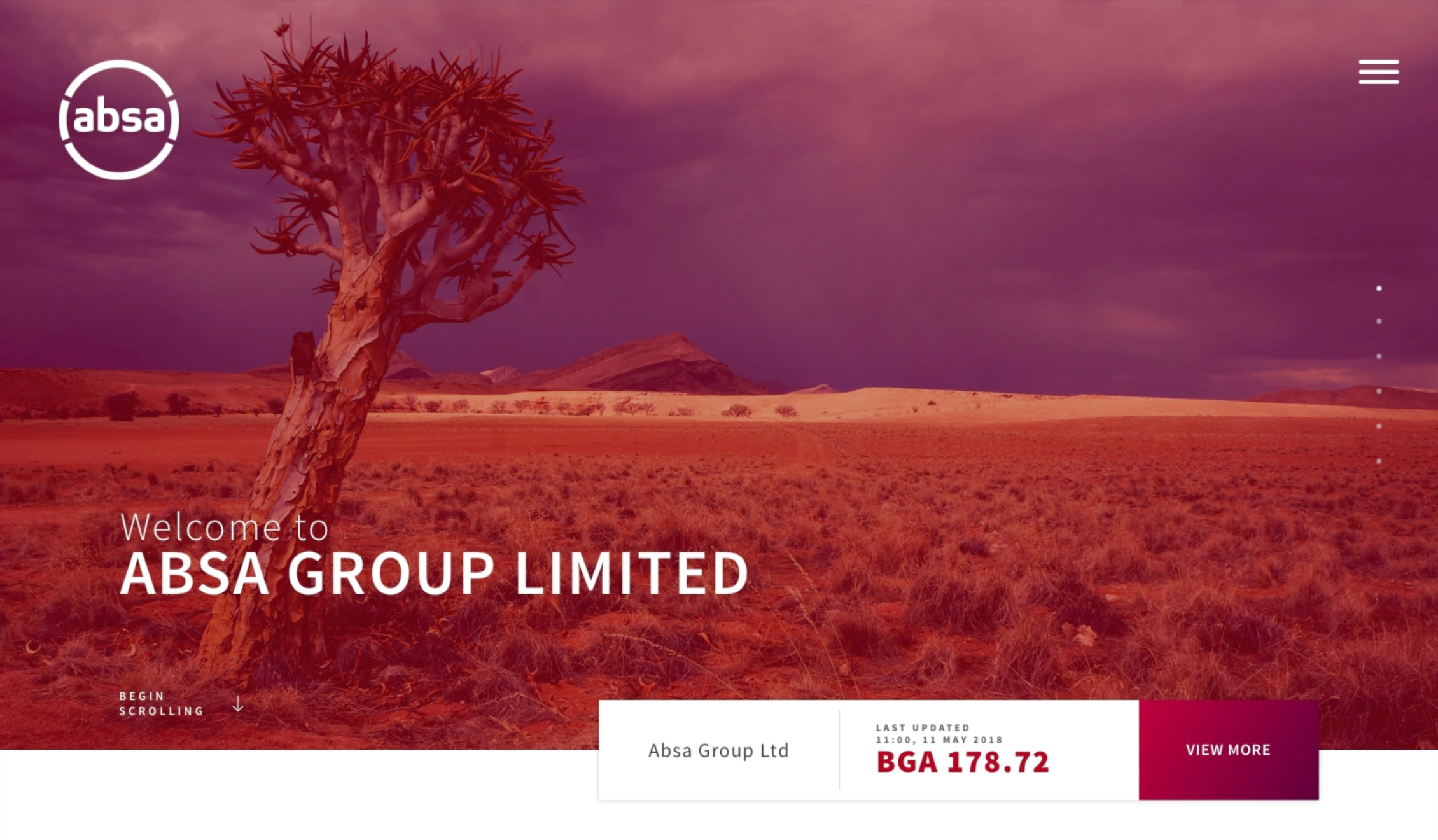
Absa Bank was undergoing one of the most significant rebrands in African financial history — separating from Barclays Africa Group and relaunching as a standalone pan-African bank. The corporate website needed to launch alongside the new brand identity and reflect a business that was confident, modern, and distinctly African.
The previous site had problems with information hierarchy, use of imagery, and visual coherence. It didn't reflect the ambition of what Absa was becoming. The brief was open — no restrictions beyond using the new brand material — and the goal was clear: build something the bank could be proud of, and lay the foundations for a scalable digital presence across all platforms.
I was the sole designer on the project.
What I did
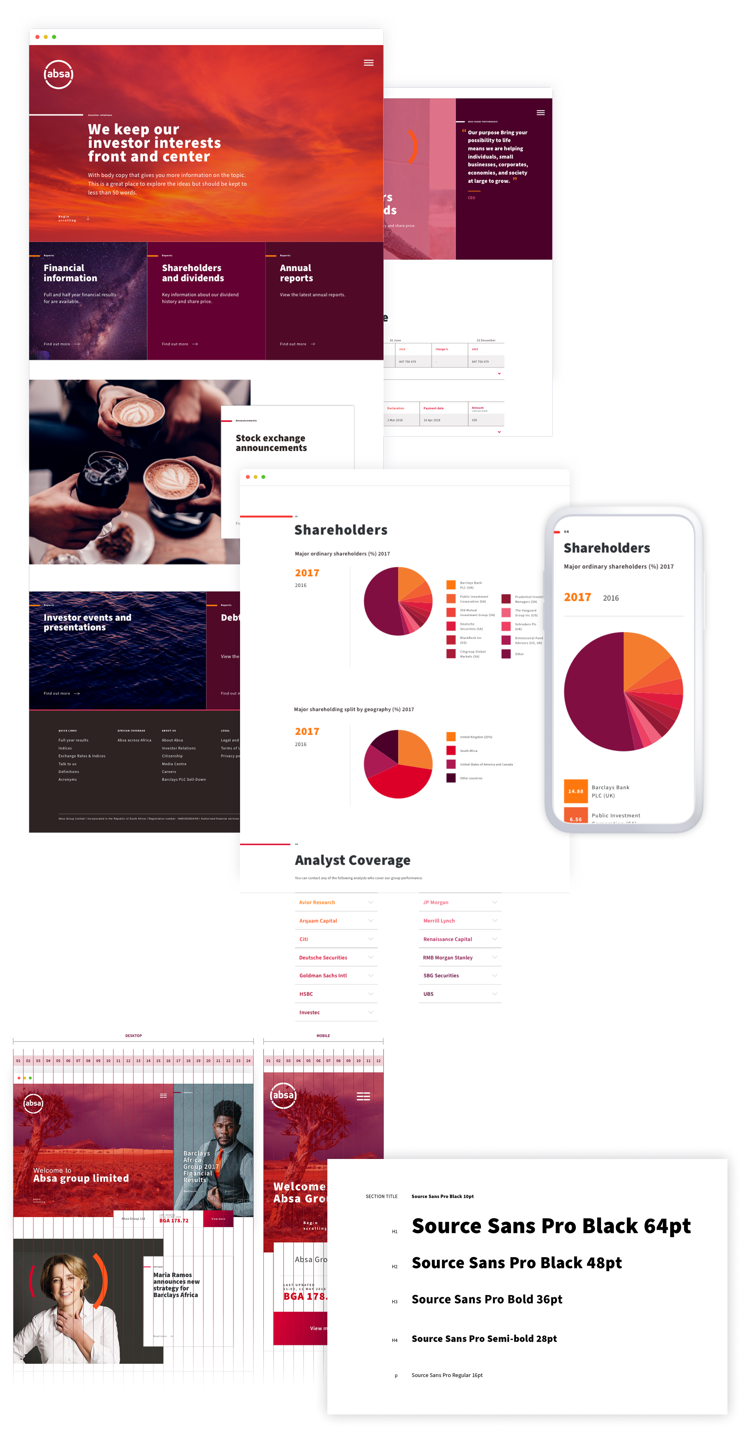
The first decision was to scrap the existing site structure entirely and start fresh. Rather than adapting what was there, we redesigned the content hierarchy, grid, and visual language from the ground up.
Working closely with the development team throughout, I identified early that the existing 12-column grid with margins and padding was creating significant responsiveness problems for the engineers. I switched to a 24-column grid with no margins or padding — which simplified the CSS and allowed the site to display correctly across devices without ongoing developer workarounds. A small technical decision that saved significant build time.
I developed the starting point of a component library — reusable patterns, typography scales, and UI elements that could be applied consistently across the corporate site and provide a foundation for other digital platforms as the brand rolled out across the business.
To bridge the gap between design and engineering, I produced an animated prototype in addition to static designs — giving the development team a clear visual reference for interactions, transitions, and states rather than leaving them to interpret static screens.
One constraint worth noting: the new Absa logo required a containing circle to work at small sizes — a significant limitation when designing navigation bars, favicons, and compact UI elements. Designing around that constraint while maintaining brand consistency across every touchpoint was a recurring challenge throughout the project.
The result
The site launched alongside a major marketing campaign supporting the company-wide rebrand. The launch received significant press coverage across South Africa and other African markets where Absa operates.
The corporate website established a solid baseline experience that has since been applied across Absa's digital platforms. The component library foundations I built became the starting point for ongoing design work across the business — giving teams a coherent visual language to build from as the brand expanded across markets.