The constraint
Step-level analytics weren't available during the redesign. No drop-off by screen, no completion funnels, no quantitative signal about where users were struggling.
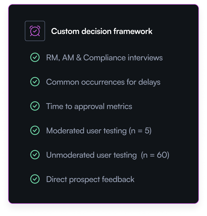
The instinct in that situation is to default to opinion-led design. Instead, working in close collaboration with the product manager, I built an alternative decision framework from the data that was available.
Building the decision framework
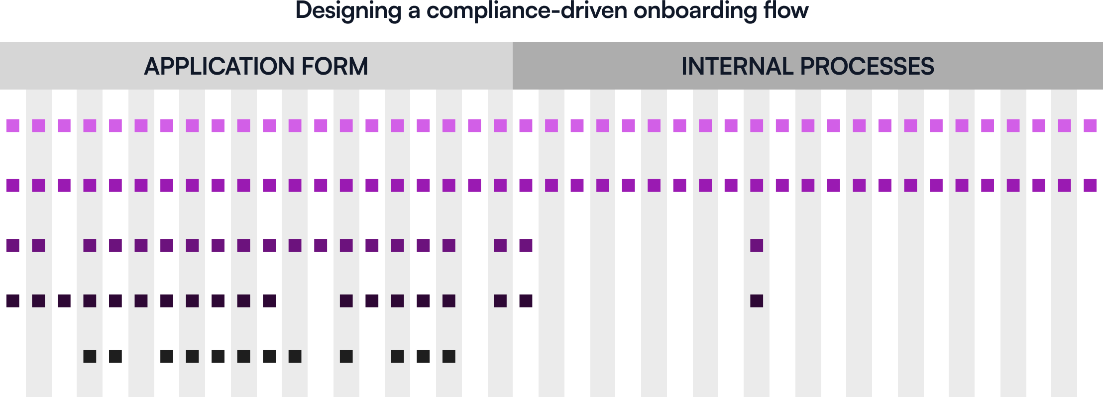
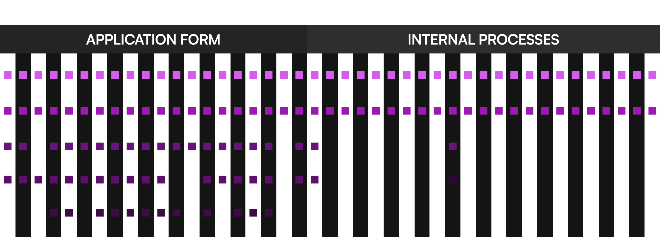
I started with a customer journey map as the foundation, a single surface to capture everything we knew and everything we needed to find out.
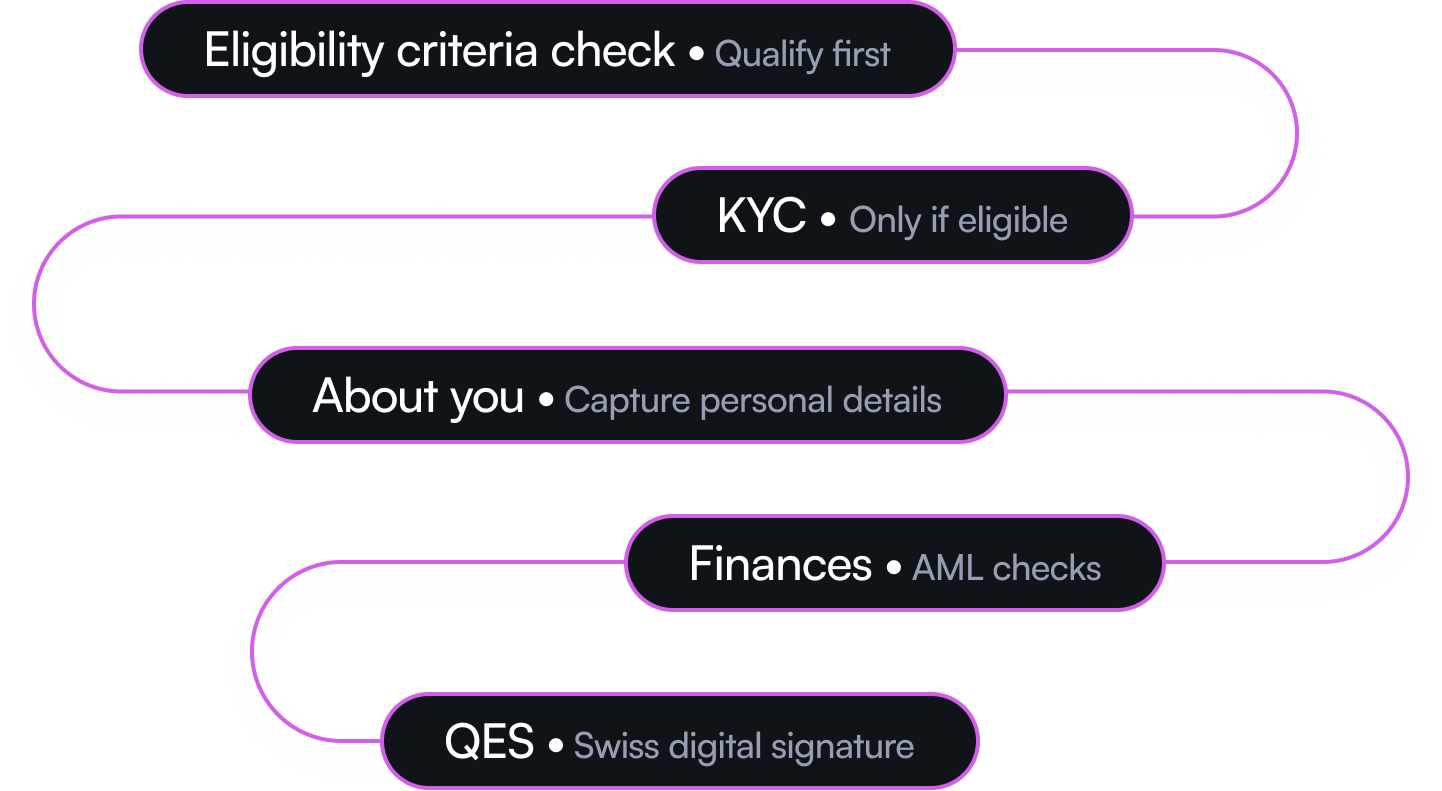
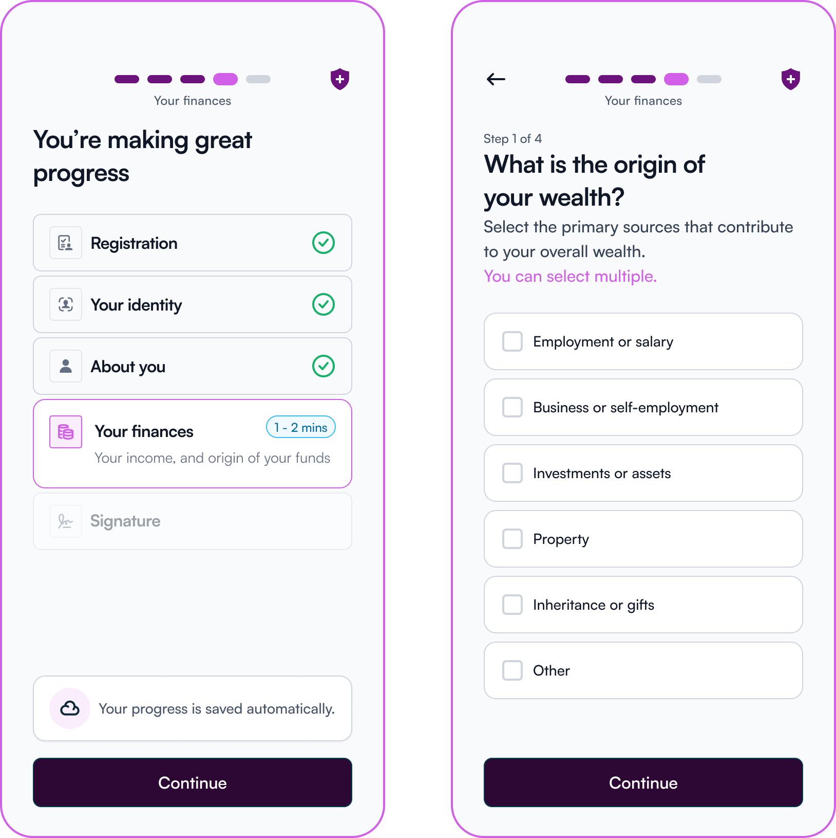
From there we ran structured interviews with Relationship Managers, Account Managers, and the Compliance team. The goal was to understand three things: what the current process looked like end to end, how long each stage took, and crucially, what information wasn't being captured during the digital application that had to be followed up manually afterwards.
That last question was the most important. It turned internal teams from stakeholders into data sources. Every piece of information they were chasing after submission was a gap in the digital flow I could close.
I also ran a UX analysis of the existing journey and plotted both findings on the journey map, internal pain points alongside user experience observations, so redesign decisions were anchored to a complete picture of where the process was breaking down.
What the research found
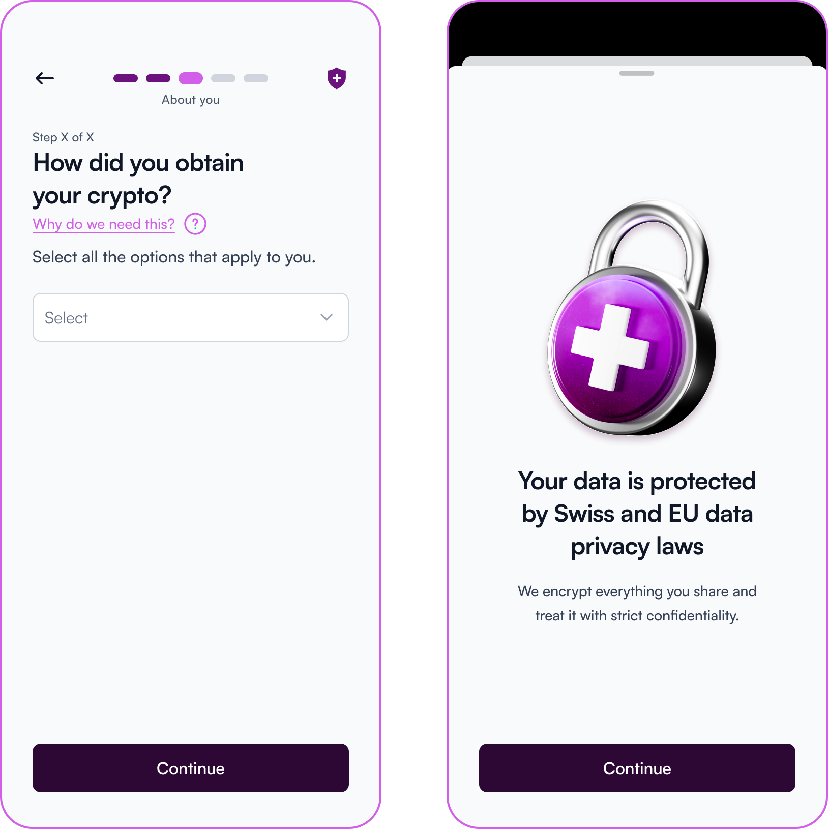
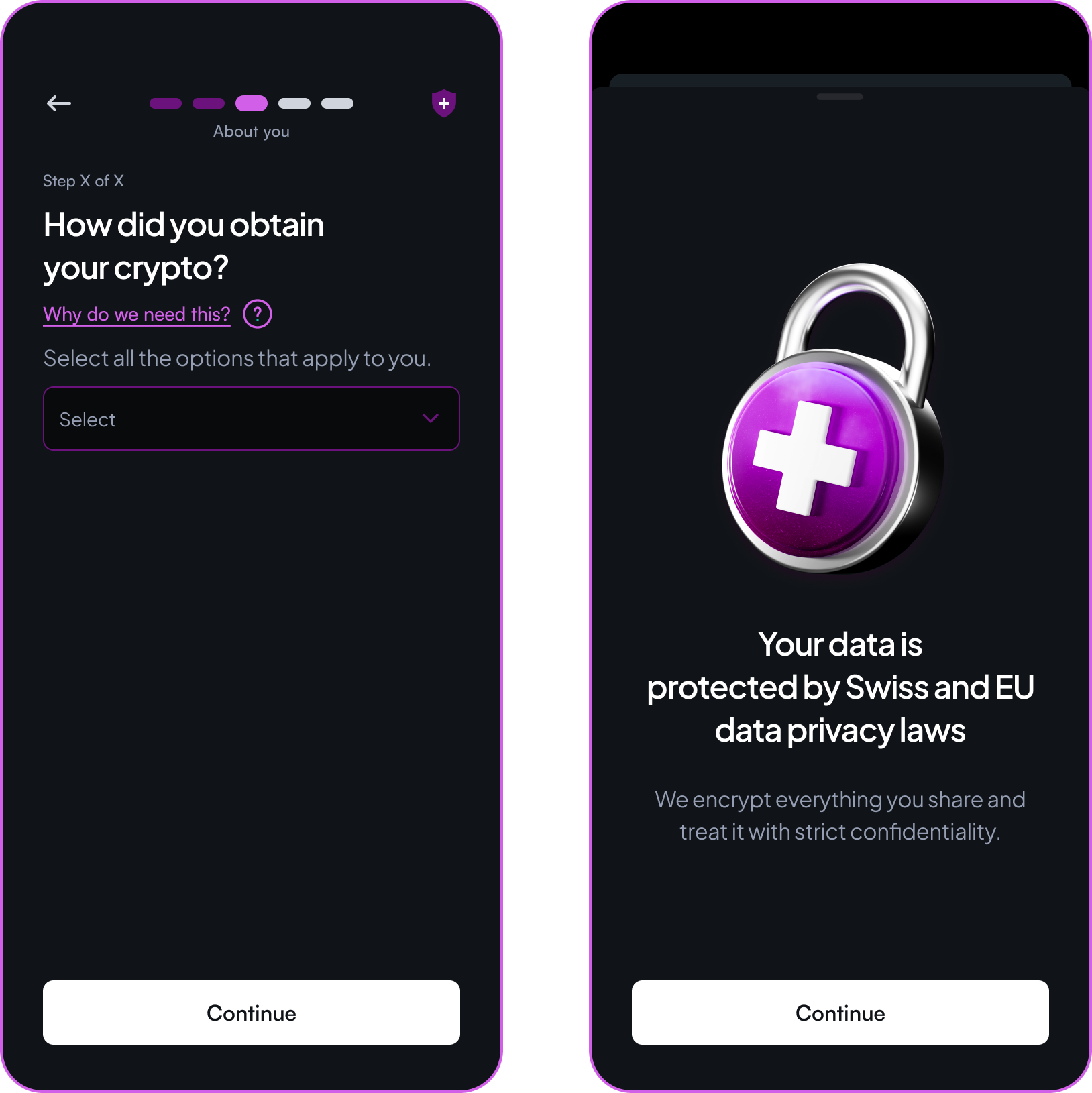
User testing across moderated and unmoderated sessions validated the redesigned flow but surfaced an unexpected insight: users were reticent to share their crypto information.
Digging into that finding with the Relationship Managers revealed the reason. Users were only comfortable disclosing crypto details after they had spoken to a Relationship Manager directly. The digital flow was asking for sensitive financial information without the trust foundation that made people willing to give it.
How the design responded
This insight drove two specific design decisions.
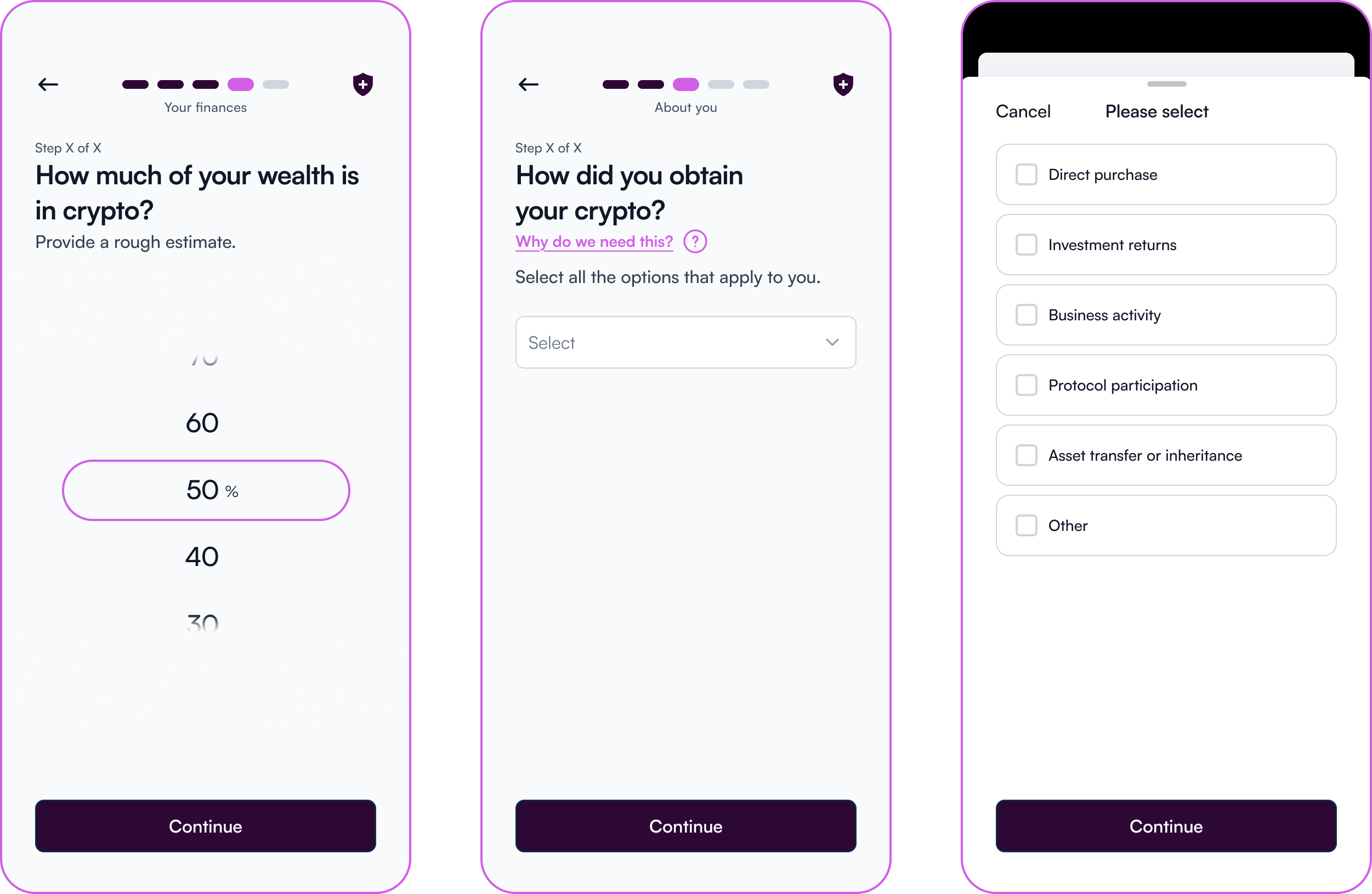
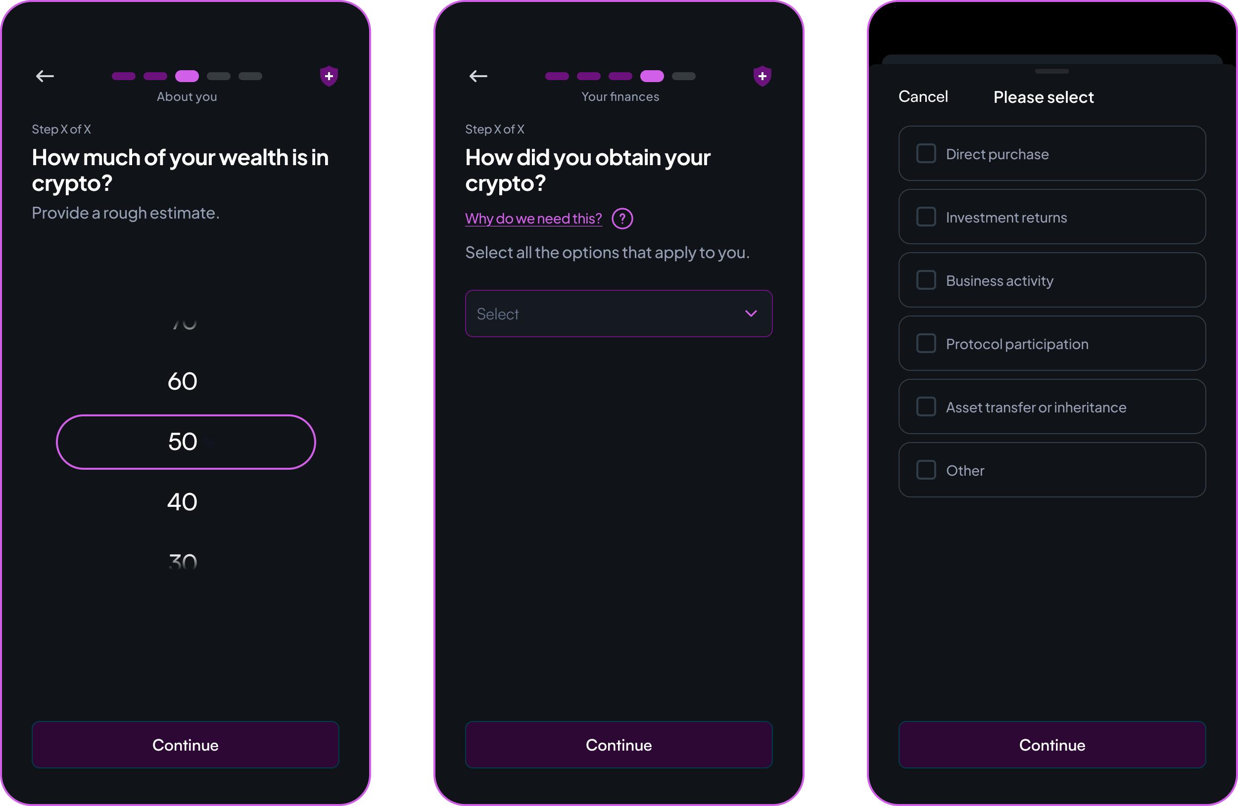
The first was using the crypto source question as a routing mechanism. A user's answer to how they obtained their crypto indicates their likely level of complexity as a holder. For straightforward cases, the digital journey handles them fully. For more complex situations, where the nature of the assets requires more nuanced handling, the journey routes them to a human conversation where trust is higher. The digital form captures what it can. The relationship handles the rest.
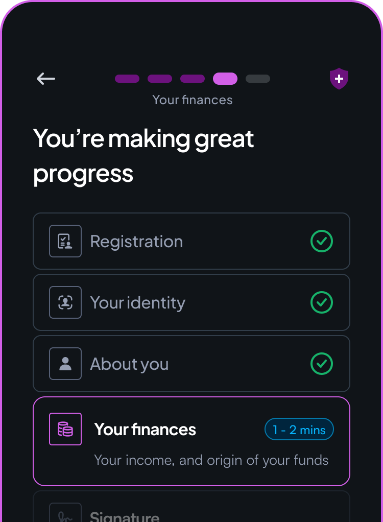
The second was capturing crypto wealth as a proportion of total net worth directly in the flow, rather than leaving reviewers to infer it manually from incomplete information. This single input gave the review team a signal they previously had to chase, reducing a recurring category of post-submission follow-up.
Why this matters
The crypto reticence finding could have been treated as a UX problem to solve through better copy or reassurance messaging. Instead it pointed to something more fundamental: some disclosures require human trust before digital collection is possible, and designing around that reality is more effective than designing against it.
The research didn't give us a dashboard. It gave us something more useful: an understanding of why users were hesitating, not just where.